Understanding How to Decorate with Lavender Paint Colors
Color is one of the greatest gifts from the natural world. Virtually every color in the world is represented in nature, and lavender is among them. From the actual plant to sunsets to the mountain ranges, lavender is a hue that makes the world come alive, and it can do the same for your home. Today, our team at Superior Paint & Decorating discusses the unique personality of lavender and how you can use it to transform various rooms in your home.

The Lulling Personality of Lavender
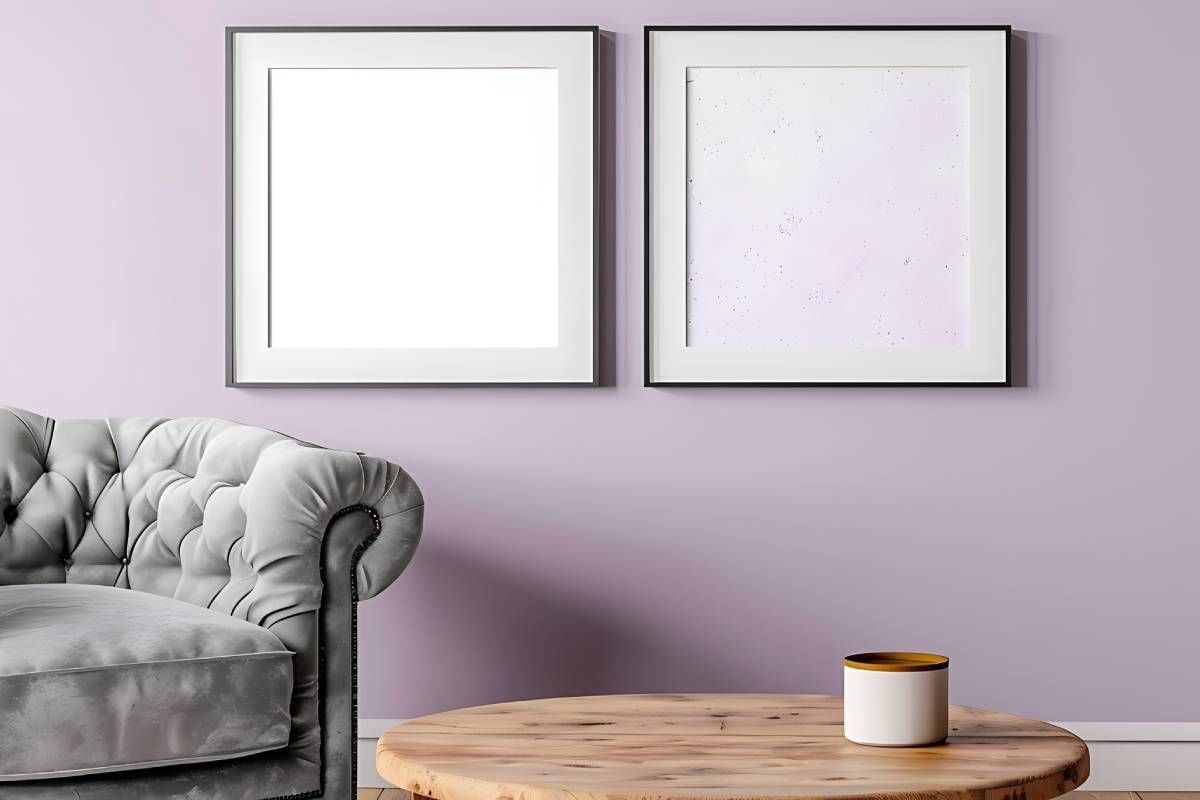
All hues on the color wheel have a distinct personality, and lavender is no exception. It floats between purple and lilac, and when used in décor, it evokes a serene, sophisticated elegance. Lavender is a delicate, luxurious hue that can dreamily transform any space. While you might associate lavender with femininity, it can also invoke a youthful, lively ambiance.
Lavender is a perfect color for creating spaces that induce relaxation and a calming serenity, so it is a great choice for bedrooms and formal dining rooms. Let’s move on to how you can use various shades of lavender to create harmonious spaces in your home.
Try Lavender Blue Paint for a Calming Dining Experience
If you are an avid holiday entertainer, giving your dining room a crisp seasonal feel is an excellent way to impress your guests. Lavender Blue 1438, a rich combination of grey and pale purple, creates a welcoming, stunning space. Use this luscious hue on your dining room walls or even trim, and then offset it with a light complimentary color like Oxford White 869. This classic bright white can even out the room and offer the perfect sense of balance.
Consider Springview Green 491, a downy pale green paint color for holiday linens and florals. Think about using another complementary color like Fossil AF-65, a subtle beige that acts as the perfect secondary or tertiary color in a space.
Use Lily Lavender in a Chic Bedroom
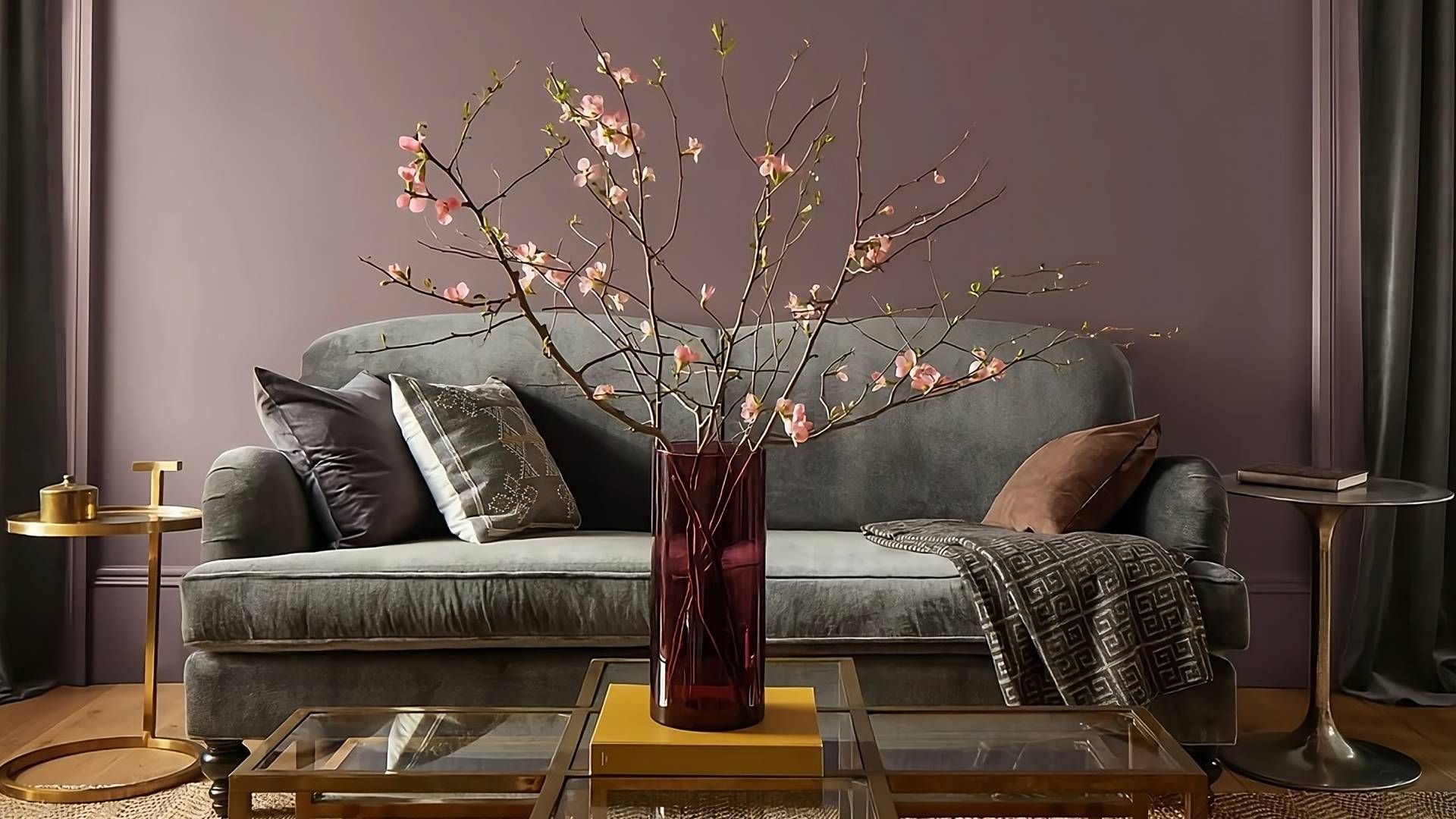
Named for the flowers, Lily Lavender 2071-60 is a blushed light purple packed with charm and grace. This calming yet stunning hue is an excellent choice for bedrooms where you want to evoke a serene, calming aesthetic. You can offset this paint on the walls by painting the trim in complementary colors like Blue Note 2129-30, which is a dark, lush gray with deep navy undertones.
A combination like this provides a startling contrast that draws the eye. To finish off the space, you can use another complementary hue like Alabaster 876, an airy white with a shadow of blush pink, for bedding, draperies, and pillows.
Visit Us for Benjamin Moore Lavender Paint Colors Near Lexington, KY
For over three decades, Superior Paint & Decorating has been your top source for Benjamin Moore paint. We are family-owned and operated and take great pride in our products and customer service philosophy. When you are ready to enhance your home with lavender paint, please visit our showroom at 2551 Regency Rd #104, Lexington, KY, or request an online consultation, and one of our friendly staff will reach out. Contact us today!


